
Tree Grid
comins-table@0.2.2
Starting with 0.2.2, .render is the standard UI customization entry point. Legacy properties remain supported throughout 0.x, with removal targeted for 1.0.0. See the migration rules.
Tree Grid renders controlled nested rows while preserving the existing column model. Put the business row in item; existing columns such as { field: "name" } and cell formatters continue to receive that object.
import { useRef, useState } from "react";import { CominsTable, type CominsTableRef, type CominsTreeNode } from "comins-table";
const columns = [  { field: "name", label: "Name", sort: true },  { field: "age", label: "Age", sort: true },  { field: "role", label: "Role" },];
const initialData: Array<CominsTreeNode<{ id: string; name: string; age: number; role: string }>> = [  {    item: { id: "engineering", name: "Engineering", age: 60, role: "Owner" },    expand: false,    children: [      {        item: { id: "platform", name: "Platform Team", age: 32, role: "Editor" },      },    ],  },];
export function DepartmentTable() {  const [data, setData] = useState(initialData);  const tableRef = useRef<CominsTableRef<(typeof initialData)[number]["item"]>>(null);
  return (    <>      <button onClick={() => tableRef.current?.expand(["engineering"])}>Expand</button>      <button onClick={() => tableRef.current?.fold()}>Fold all</button>      <CominsTable        ref={tableRef}        columns={columns}        data={data}        defaultExpandAll={false}        getRowId={(item) => item.id}        onChangeData={setData}        summary={{ columns: { age: "sum" } }}        tree        virtualized      />    </>  );}
Controlled data contract
Section titled “Controlled data contract”datais an array of{ item, expand?, children? }nodes.itemis the row value used by columns, formatters, renderers, row callbacks, andgetRowId.defaultExpandAllsets the initial fallback for nodes without an explicitexpandvalue and defaults totrue. An explicit nodeexpandvalue takes precedence. Changes todefaultExpandAllafter mount do not reset controlled node state.- Node
expandcontrols whether its direct descendants participate in the visible pre-order row list. childrenis a recursive node array.getRowId(item)must return a stable id that is globally unique across every level, including currently collapsed descendants.- The expander and cell updates emit a new tree through
onChangeData; caller-owned nodes are not mutated. - The first declared column is the Tree anchor. It remains fixed at the far left, does not render a column-move handle, and owns the expander even when other columns are reordered.
Tree sorting is recursive: each sibling set is sorted while a parent remains before its visible descendants. Set multiSort and use the same Shift-assisted Header gestures as the flat table to apply the complete ordered sort model to every sibling set. Summary values aggregate leaf item rows only, regardless of whether their parent is expanded. Parent values are excluded to avoid double counting.
Ref expansion controls
Section titled “Ref expansion controls”CominsTableRef exposes expand(nodeIds?) and fold(nodeIds?). Pass a readonly id array to update multiple branches in one controlled onChangeData emission. Omitting the argument targets every branch; an empty array is a no-op. Duplicate, unknown, and leaf ids are ignored.
tableRef.current?.expand(["engineering", "platform"]);tableRef.current?.fold(["platform"]);tableRef.current?.expand(); // expand all branchestableRef.current?.fold(); // fold all branchesExpanding a descendant is blocked while an ancestor remains folded. Include the folded ancestor and descendant in the same expand call when both must open together. The methods are safe no-ops on a flat table.
Styles, components, and renderers
Section titled “Styles, components, and renderers”Tree Grid reuses the current row and cell contracts. Use rowProps.className and rowProps.style for hierarchy-aware row styling. Existing column cell.components types such as checkbox, select, and toggle read and update the node’s item. cell.render can return a custom React component for any tree node; no separate component-row API is required.
The Playground includes a fixed-row-height virtualized tree with exactly 10000 nodes. Virtualization renders only the current window while hierarchy flattening and ref expansion continue to operate on the controlled tree.
Tree Grid V1 limits
Section titled “Tree Grid V1 limits”Tree Grid supports fixed and automatic Row heights. Pagination, lazy loading, infinite scrolling, Viewport Datasource, cross-table Tree movement and row-level copy/paste remain unavailable. Cell and range clipboard operations remain scoped to visible item rows.
Tree expansion is not flat Row Expand or Row Grouping. Row Expand renders a Detail region below one flat source Row. Row Grouping derives a hierarchy from flat Row values and keeps separate controlled group expansion state; it cannot be combined with the Tree Grid prop branch.
Run the runnable example with npm run dev, then open /examples/tree-grid.
Column Filtering is also a flat-data projection and cannot be combined with the Tree Grid prop branch. Applications that require Tree filtering must produce their own controlled nested data.
Tree Row Drag
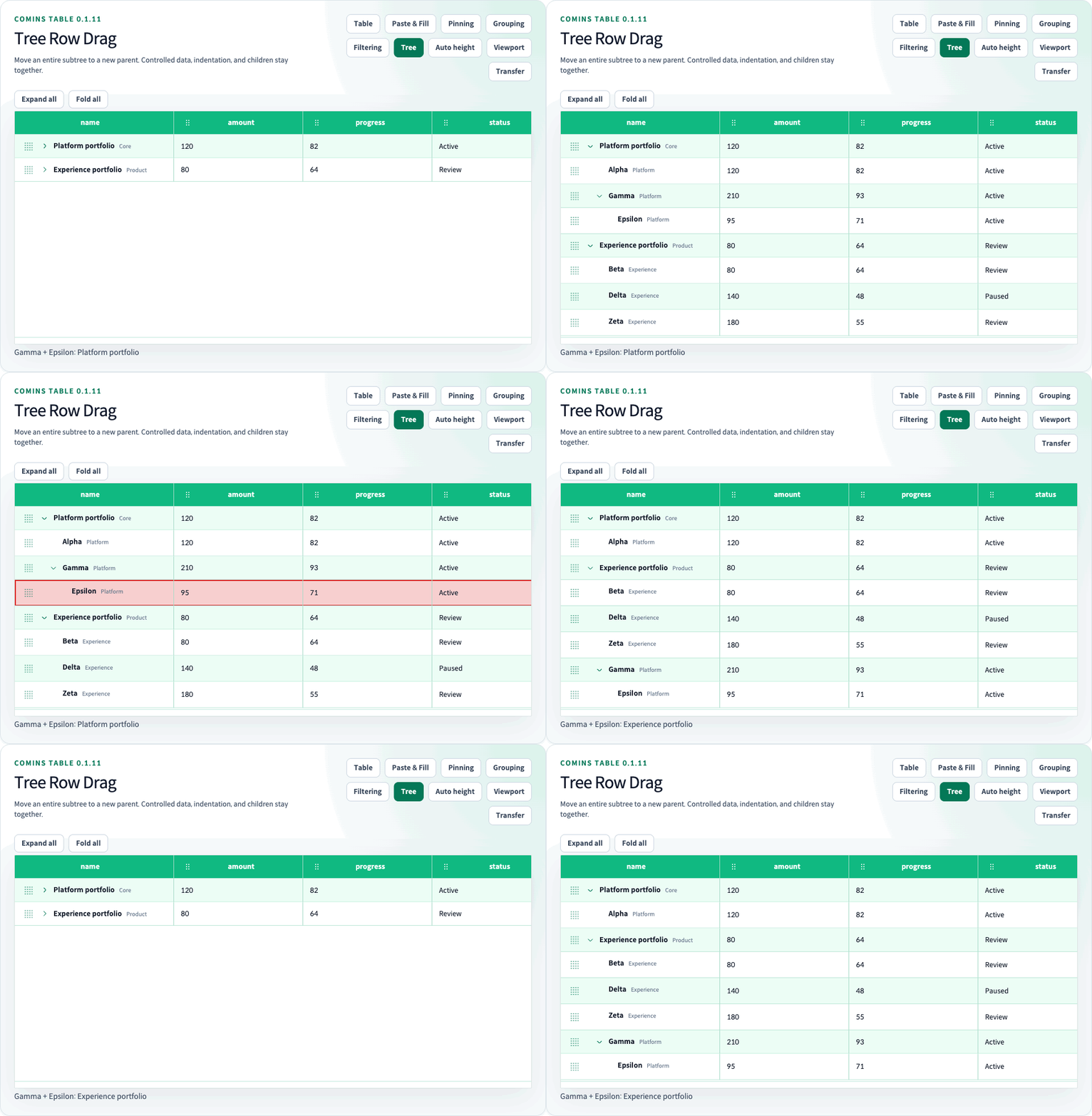
Section titled “Tree Row Drag”Tree dragging is disabled when treeRowDrag is omitted. Set treeRowDrag={{}} to reorder siblings at every depth. allowReparent defaults to false. allowReparent: true also permits moving an entire subtree into another parent or back to the root. rowProps.draggable and rowProps.disabled further constrain individual sources. onChangeData is required; the original tree and items are not mutated.
<CominsTable tree data={nodes} columns={columns} getRowId={(item) => item.id} onChangeData={setNodes} treeRowDrag={{ allowReparent: true }}/>CominsTreeRowDragConfig<TData>.canDrop receives a CominsTreeDropContext with source, target, destination and before/after/inside position. It can restrict moves but cannot permit cycles or invalid destinations. Closed descendants move with their source and keep their expansion state. A leaf can become a parent; the former parent remains a business node after its last child leaves. This changes leaf-only Summary membership.
A collapsed parent accepts an inside drop without automatically expanding. Sorting disables manual Tree movement until cleared. The handle supports pointer edge scrolling and Space to begin, arrow keys to choose a destination, Enter to commit, and Escape to cancel. Right/left choose nesting/outdent when reparenting is enabled. Destination and result are announced, and drop markers do not change Row geometry.
Tree callbacks use CominsBeforeTreeRowDragPayload, CominsTreeRowDragPayload and CominsAfterTreeRowDragPayload; their events include keyboard gestures. Returning false before a gesture starts cancels it without an after callback. A started gesture ends once. Target metadata includes tree.parentId, tree.beforeRowId and tree.position.
moveCominsTreeNode(nodes, rowId, destination, getRowId, { allowReparent }) exposes the immutable operation. CominsTreeMoveDestination uses parentId: null for the root and beforeRowId: null for the sibling-list end. It returns the original reference for unchanged or invalid moves and rejects duplicate IDs. IDs must remain stable when positions change.
The Playground Tree drag sample starts with allowReparent and automatic Row heights enabled so both behaviors can be exercised immediately. These example defaults do not change the package defaults.
Tree slots (0.2.1)
Section titled “Tree slots (0.2.1)”Use treeSlots on a Tree Grid to customize the first column with leading, content, and trailing callbacks. The Table keeps indentation, the expander, and the leaf spacer. Leading content follows the expander; trailing content aligns with the end of the cell. Other columns keep their existing renderers.
Content that exceeds the available width is clipped so it cannot overlap the trailing action. Keep leading and trailing controls compact and size their column to fit them.
CominsTreeSlots<TData> callbacks receive CominsTreeSlotParams<TData>: item, rowId, depth, path, expanded, hasChildren, and defaultContent. Node fields follow CominsVisibleTreeRow; expanded reflects the configured expansion state, including on leaves, so use hasChildren to distinguish branches. defaultContent is the existing cell renderer, built-in component, or formatted value. Omitting content preserves it; returning null intentionally hides it. Read the payload without mutating the application-owned item or path.
<CominsTable tree data={nodes} columns={columns} getRowId={(item) => item.id} onChangeData={setNodes} treeSlots={{ leading: { render: ({ hasChildren }) => <span aria-hidden="true">{hasChildren ? "▸" : "·"}</span> }, content: { render: ({ defaultContent }) => <strong>{defaultContent}</strong> }, trailing: { render: ({ item }) => <button type="button" onClick={() => showDetails(item)}>Details</button> }, }}/>Images and React components can be returned from any slot. Native buttons, links, form inputs and their associated labels, editable elements, focusable elements, and common button/checkbox/switch/menuitem roles keep their click, pointer, context-menu, keyboard, copy, and paste events separate from Table selection, editing, and callbacks without cancelling native defaults. Plain slot labels remain selectable as part of the row and retain Table copy/paste behavior. Applications own the accessibility labels, disabled state, and behavior of custom controls; use semantic controls for actions. Do not put a focusable wrapper around unrelated row text unless the entire wrapper is intended to be an independent control.
The callbacks are React rendering contracts exported from comins-table; they do not add React or DOM types to /core. The Playground’s Tree node slots example combines a leading image, custom content, and a trailing action while showing selection and action counts.